
Platform at a Glance
A first look at how one console is designed to carry an event from build, through ticket sales, to proof of what it delivered.
These images are illustrations of the concept, not screenshots of the actual product.
Overview
This concept shows the logged-out front door of EventfullyManaged: the page a prospective organizer reads before there is any account, any event or any data. It is designed to answer three questions in one scroll - what the platform covers, how an event moves through it, and which capabilities are included.
The problem it speaks to is familiar to anyone who has run an event. Ticketing lives in one tool, the agenda in a spreadsheet, the badge list on a laptop at the door, and the report that proves the event worked is assembled by hand a week later. The landing concept answers with a single claim: one platform for the entire lifecycle, from planning through post-event analytics.
The illustrated page reads top to bottom. A floating header carries the calendar-check wordmark, links to the features, how-it-works and platform sections, a plain sign-in link and a filled get-started button. The hero pairs a small waitlist notice with a one-line headline, a one-sentence summary of the lifecycle, and two actions: join the waitlist or sign in. Beneath it, a three-step row sketches the arc of an event - build it, open registration and sell, then run it and prove the outcome.
The closing section is a six-card feature grid: registration and ticketing, agenda and venue, QR check-in, networking, live analytics, and a governed-by-default card that frames data security as part of every stage. Each card carries an outline icon, a short label and a single line of explanation.
Those six cards are the map for everything else in this concept set. Each one corresponds to an area of the organizer console illustrated elsewhere - the dashboard, the event and agenda builders, ticket tiers, the check-in kiosk, networking and the analytics views - so a visitor can see where their own work would land before creating anything.
What this concept shows
- A floating top bar with the wordmark, section links, a plain sign-in link and a filled get-started button
- A hero that pairs a waitlist notice with a one-sentence summary of the event lifecycle
- Two calls to action side by side - join the waitlist, or sign in to the console
- A three-step how-it-works row: build the event, open registration and sell, then run it and prove the result
- A six-card feature grid covering registration and ticketing, agenda and venue, QR check-in, networking, live analytics and governance
- Each feature card carries an outline icon, a short heading and one line of explanation
- A soft gradient backdrop and light, glass-like surfaces that carry through into the signed-in console
How it works
- Arrive on the page and read the hero - a waitlist notice, the headline promise and a single sentence describing the lifecycle the platform covers.
- Scan the three-step row to see the arc of an event: build it, open registration and sell tickets, then run it and prove what it delivered.
- Read the six feature cards to find the area that matches the problem at hand, from ticketing to check-in to live analytics.
- Choose an action - join the waitlist from the hero, or sign in to open the organizer console.
Who it's for
- Event organizers evaluating an all-in-one platform
- Conference and summit producers
- Agency and event-management teams running many client events
- Marketing and operations leaders comparing event tooling
Illustrations
1 illustration of this concept. Select one to view it full size.
Landing Page - Hero, How It Works and Features
A wide desktop page on a soft gradient background. A rounded header floats above the content with the calendar-check logo and wordmark on the left, three section links in the middle, and a plain sign-in link beside a filled get-started button. The hero centers a small pill inviting visitors to join the waitlist, a one-line headline whose closing phrase is set in a gradient, a two-line summary of the lifecycle from planning to post-event analytics, and a pair of buttons for joining the waitlist or signing in. Below, a how-it-works section shows three outlined icons with short step labels for building an event, opening registration and selling, and running the event and proving results. A final section presents six feature cards in two rows of three - registration and ticketing, agenda and venue, QR check-in, networking, live analytics and governance - each with an icon, a heading and one explanatory line.
Topics
- event management platform
- all-in-one event software
- event lifecycle
- event registration and ticketing
- QR check-in
- event analytics
- conference management software
- event planning tool
- attendee engagement
- event platform overview
Related concepts
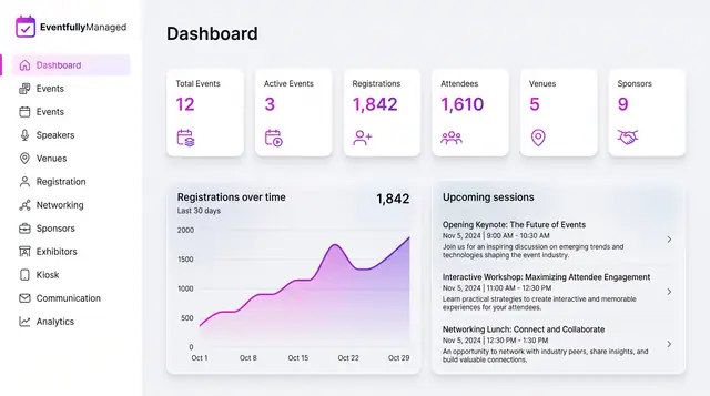
Organizer Dashboard in Light and Dark
One home screen with portfolio totals, a registration trend and the sessions coming next, designed to read the same in light or dark.
2 illustrations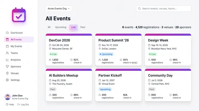
Event Portfolio and Event Setup
From an organization-wide portfolio down to one event's details: browse the calendar, create an event, then work from its overview.
4 illustrations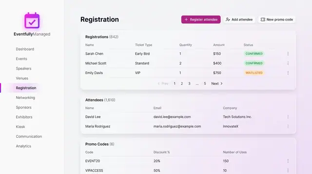
Registration and Attendee Sign-Up
See registrations and attendees in one place, and sign people up through a guided flow with ticket choice, promo codes and a total.
2 illustrations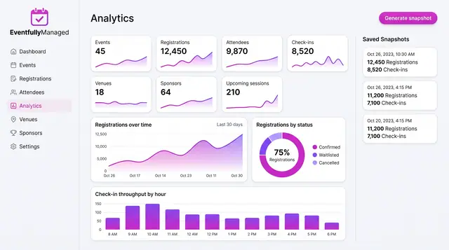
Analytics, Forecasts and Anomaly Watch
Track live event metrics, save point-in-time snapshots, and preview how forecasts and check-in alerts could build on them.
3 illustrations