
Analytics, Forecasts and Anomaly Watch
Track live event metrics, save point-in-time snapshots, and preview how forecasts and check-in alerts could build on them.
These images are illustrations of the concept, not screenshots of the actual product.
Overview
This concept covers how EventfullyManaged is designed to turn event operations into numbers an organizer can act on. It moves across three screens: an Analytics page of live metrics and saved snapshots, a dark-theme version of that page that adds an attendance forecast section badged as roadmap, and an Event Ops Intelligence page, also badged as roadmap, that previews scheduled planning briefs and a watch on check-in.
Event teams often learn how an event went a week after it ends, when someone reconciles registration exports, check-in lists and sponsor spreadsheets by hand. The gap hurts most during the event itself, when a quiet entrance or an under-filled track needs attention now rather than in the post-mortem. Because registrations, check-ins, sessions and sponsors share one record in EventfullyManaged, the design can show them side by side and keep a history of how they changed.
The first screen pairs metric tiles for events, registrations, attendees, check-ins, venues, sponsors and upcoming sessions, each with a small trend line, with a registrations-over-time chart, a donut splitting registrations into confirmed, waitlisted and cancelled, and an hourly check-in throughput chart. A Generate snapshot button captures the current totals into a saved list, so an organizer can compare pre-event, mid-event and post-event states. The second screen scopes check-in throughput to a single event and sets out the forecast the design envisions: expected arrivals against registrations, a predicted no-show rate per session, and capacity and staffing guidance, with a note that forecasts are meant to be stored as snapshots and scored against actual arrivals.
The third screen carries the same data into operations. A timeline of planning briefs at thirty days, seven days and one day before the event lists decisions ranked by severity, such as an under-registered track or a sponsor behind on leads, each with a Review action. Beside it, a check-in anomaly watch plots hourly entry scans and raises alerts when a station goes quiet or arrivals fall below expectation. An Autonomy boundary panel keeps automatic actions, such as sending attendee announcements or opening extra check-in lanes, behind explicit switches, so people stay in control.
Analytics sits downstream of the rest of the product: registration and ticketing feed its totals, the QR check-in kiosk feeds throughput, and announcements and campaigns are what a planning brief would remind an organizer to schedule.
What this concept shows
- Metric tiles for events, registrations, attendees, check-ins, venues, sponsors and upcoming sessions, each with a trend line
- A registrations-over-time area chart for the last 30 days and a donut of registrations by status: confirmed, waitlisted and cancelled
- An hourly check-in throughput chart that can be scoped to a single event from a picker
- A Generate snapshot action and a saved snapshot history labeled pre-event, mid-event and post-event
- An attendance forecast section, badged as roadmap, covering expected arrivals versus registrations, no-show rate per session, and capacity and staffing guidance
- Planning briefs at T-30, T-7 and T-1 days that rank decisions by severity, with a Review action on each
- A check-in anomaly watch that charts hourly entry scans and flags a silent station or a below-expected arrival rate
- Autonomy boundary switches that keep automated announcements and extra check-in lanes under human approval
How it works
- Open Analytics to read live totals, the registration trend, the status split and hourly check-in throughput.
- Choose an event in the throughput picker to focus the check-in chart on a single event.
- Select Generate snapshot at key moments, such as before doors open, mid-event and after close, to build a comparable history.
- Review the attendance forecast section to see the expected-arrivals, no-show and staffing guidance the design plans to add, with forecasts saved as snapshots and scored against actual arrivals.
- Open Event Ops Intelligence and step through the T-30, T-7 and T-1 planning briefs, reviewing each flagged decision.
- During check-in, follow the anomaly chart and its alerts for silent stations or slow arrivals, and decide which automated responses the autonomy switches allow.
Who it's for
- Event organizers and program managers
- Event operations and on-site leads
- Sponsorship and partnership managers
- Event-management agencies reporting to clients
- Leaders who need post-event impact reporting
Illustrations
3 illustrations of this concept. Select one to view it full size.
Analytics Overview with Saved Snapshots
The illustration shows the Analytics page of the organizer console in a light theme, with the left sidebar highlighting Analytics among Dashboard, Events, Registrations, Attendees, Venues, Sponsors and Settings. A grid of seven metric tiles reports events, registrations, attendees, check-ins, venues, sponsors and upcoming sessions, each with a small trend line beneath its sample figure. Below, a Registrations over time area chart covers the last 30 days, and a Registrations by status donut splits the total into confirmed, waitlisted and cancelled, with confirmed as the largest share in the sample data. A Check-in throughput by hour bar chart runs from morning to early evening and peaks mid-morning. On the right, a Saved Snapshots column lists dated captures of registration and check-in totals, and a Generate snapshot button at the top right adds a new one, showing how organizers could compare the event at different moments.
Event-Scoped Throughput and Attendance Forecast
This dark-theme illustration shows the Analytics area with the full organizer navigation, an organization switcher and a search bar for events, attendees and venues. The subtitle describes live metrics from event operations plus point-in-time snapshots the organizer controls. A summary card lists sample totals for events, registrations, attendees and check-ins today. A Check-in throughput chart, scoped to one event through a dropdown, plots hourly entry scans from 08:00 to 18:00 with a sharp morning peak. A Snapshots panel lists pre-event, mid-event and post-event captures above a Generate snapshot button. Beneath, an Attendance forecast section carries a Roadmap badge and three Coming soon cards: expected arrivals versus registrations, predicted no-show rate per session, and capacity and staffing guidance, each with a faded placeholder chart. A footnote explains that forecasts would be stored as snapshots so they can be scored against actual arrivals.
Event Ops Intelligence: Planning Briefs and Anomaly Watch
The illustration shows an Event Ops Intelligence page in the dark theme, marked with a Roadmap badge and described as scheduled planning briefs plus a live watch on check-in. A three-step timeline sets briefs at T-30 days, T-7 days and T-1 day, each tagged Planned, with T-7 selected. The Planning brief panel, labeled as a preview, lists four decisions with color-coded severity dots and a Review button each: an under-registered track, unresolved agenda conflicts, a platinum sponsor behind its leads target and an unscheduled day-of logistics campaign, all sample items. Beside it, a Check-in anomaly watch charts hourly entry scans and shows two alerts, one for a gate station with no recent scans and one for an arrival rate below expectation. Both panels carry a preview-only footer. An Autonomy boundary section holds switches, both off, for sending attendee announcements automatically, which requires approval, and for opening extra check-in lanes.
Topics
- event analytics dashboard
- event registration analytics
- check-in throughput by hour
- post-event report
- event metrics snapshots
- attendance forecasting
- event no-show prediction
- event check-in anomaly detection
- event ops planning brief
- live event monitoring
Related concepts
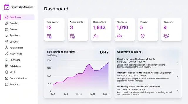
Organizer Dashboard in Light and Dark
One home screen with portfolio totals, a registration trend and the sessions coming next, designed to read the same in light or dark.
2 illustrations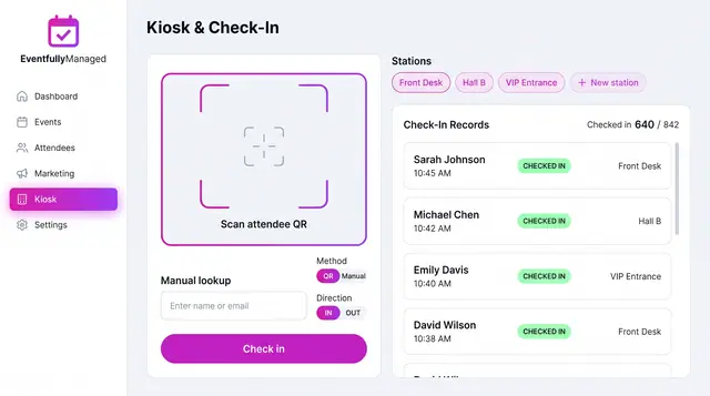
QR Check-In Kiosk
Scan attendee QR codes or look people up by name across named stations, with a live feed of check-ins against registrations.
1 illustration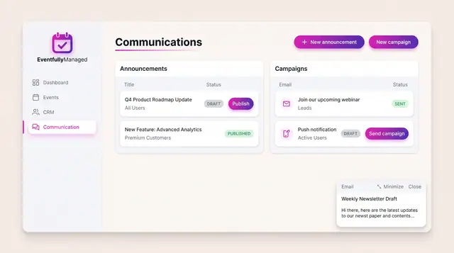
Announcements and Campaigns
Draft and publish announcements to chosen audiences and send email or push campaigns, with clear draft, published and sent states.
1 illustration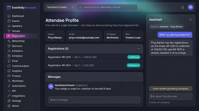
AI Assistant and Agent Tools
Ask about the record on screen, or connect your own AI client to event tools that run on your permissions.
2 illustrations